Typographic Journal: Lavender
This was my final project for Type III. The assignment was to create a system for a journal. My first step was to chose a subject of the journals and to identify how often the issues would be published. I knew rather quickly that I wanted the focus of the journal to be about LGBT+ issues. I went from wanting it to be about current events, to history, and finally landed on Film and Literature in the community. The journals would be issued every 2 months, so there would be 6 issues over a year. The name "Lavender" comes from a movement of Lesbians in the 1970's called The Lavender Menace, but the color lavender has been associated with the LGBT+ community since the 1940's.
Process


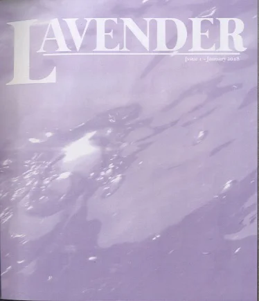
The masthead iterations were very exciting and fun to work with. We completed an exercise in groups of four where we printed out the name of our journal in a number of fonts and then passed them around and built off of each others' changes. After the exercise I narrowed down to a few that I liked and re-created them in illustrator and began looking at them on a cover of the magazine. Of those I chose the one that I liked best and began working on the spreads for the journal.
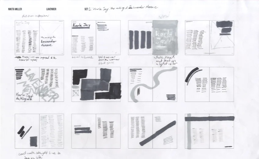
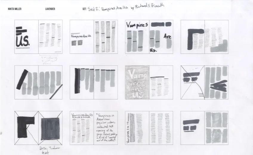
These are products of a series of assignments that helped with spread ideation without designing the full spread. I have used this flat plan system in almost all of my print assignments since this one and I have found the technique incredibly helpful, especially when there is a limited number of pages based on budget limitations.
The spread ideations let me quickly experiment with hierarchy across the pages. None of these ideations made it into the final journal, but they really helped me get my mind working in the right direction for grid systems and the weight of items on the page


One of our first deadlines was to have a spread for an article and spreads for a featured article, in "Spread Drafts" you can see some of the iterations my spreads went through. After this deadline and a discussion with my professor, I changed the color of the journal from purple to pink, the consensus being that a journal called Lavender being purple was too obvious.
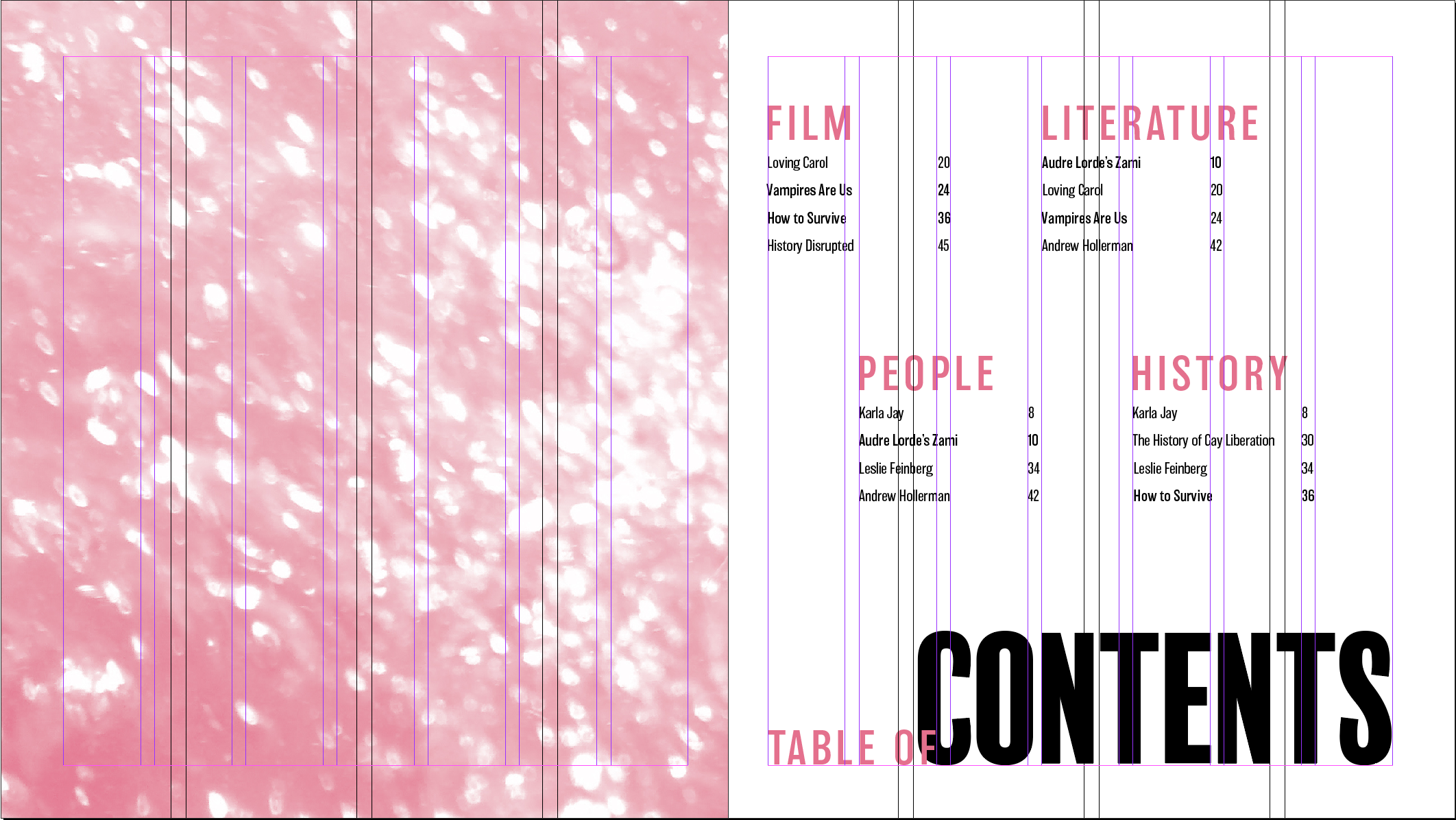


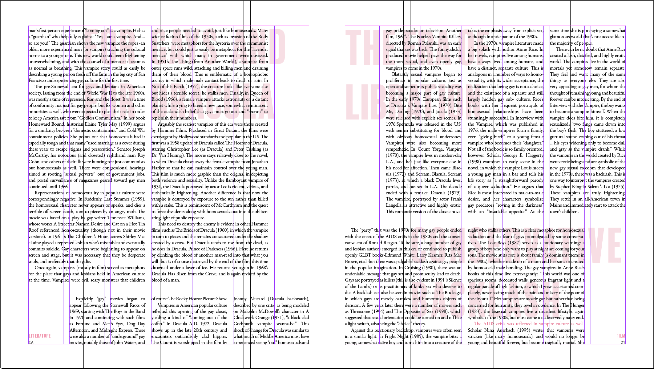

I used a 5 column grid system that fit within the margins of the page for the articles, whereas the titles, headers, and pull-outs sat on a 3 column grid that fit the page. I enjoyed the complexity of working within this system and was impressed with all of the variation in the final spreads.


