Branding for the Lavender Movement
Naming & Logotype
The Lavender Movement gets its name from a group of lesbians in the 1970’s. A leader in women’s rights at the time, Betty Friedan called this group a “Lavender Menace” because she thought that these “man-hating radicals” were going to hinder the forward motion of women’s rights. The group took the name in stride and this negative term was reclaimed quickly.
Logo Development
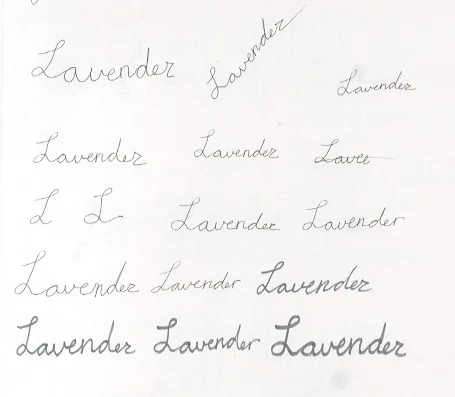
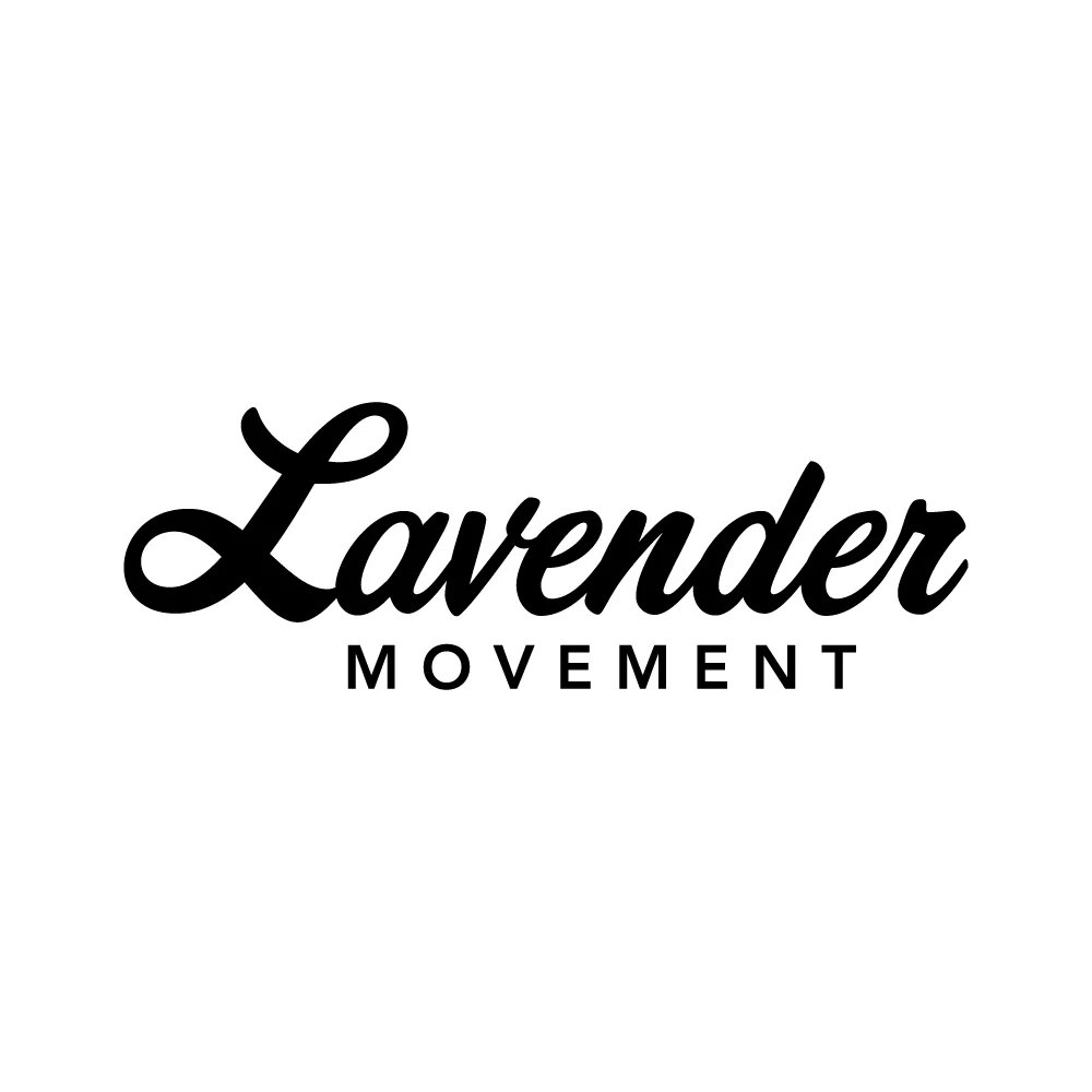
The logotype is inspired by the fluidity of gender and sexuality. I wanted a look that was hand-lettered, and came across Corner Store JF, a typeface designed by Jason Walcott. I found quickly that it needed to be juxtaposed with a more structured font. After trying out a few typefaces, like Helvetica, Futura, Mr. Eaves Sans, and a number of others, Avenir became the best option.
Imagery
Imagery was something very important. During my interview with my potential user, representation came up quite a bit, as I’m sure you can imagine. Photography isn’t used in the branding system. The goal was to make sure that everyone could feel included when experiencing any part of The Lavender Movement. There can be a lot of body image issues within the LGBT+ community. We want everyone to be able to see themselves within the stories that are being told. After determining that photography was not the right direction, I needed to figure out what could be used in its place.
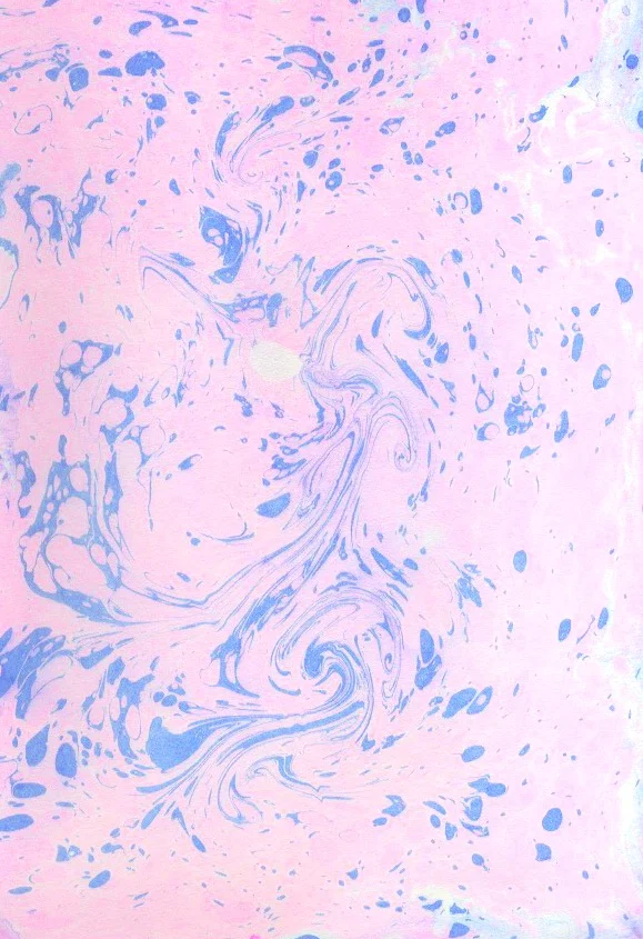
The summer before working on this project I had the opportunity to study abroad in Florence, Italy, where I was exposed to Florentine Paper Marbling. I began to experiment with paper marbling for this project, and even though the final pieces were not nearly as intricate as the designs I had seen in Florence, I was still very pleased with the outcome. The prints I was able to pull where fluid motion paused in time and were exactly what I was hoping for. All of this marbling was done by hand onto 100% cotton paper and then scanned in using a digital scanner. It was from these scans that brand colors were chosen.
Color
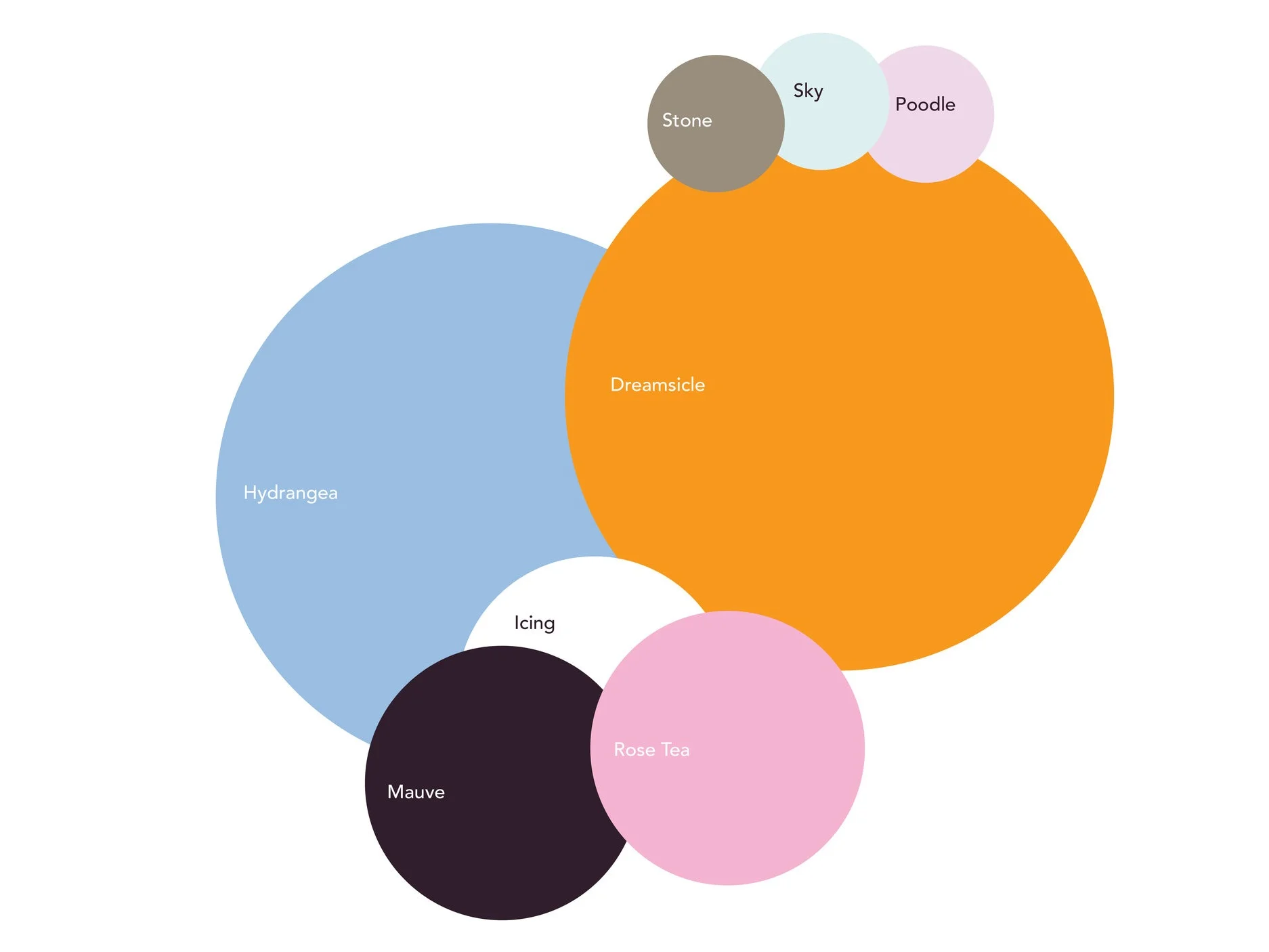
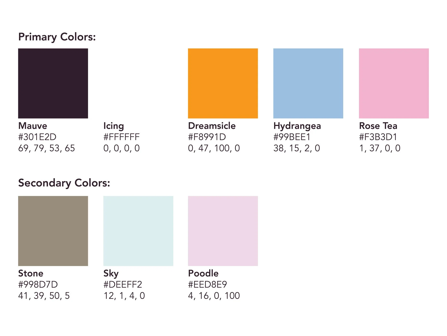
The Lavender Movement uses Orange (for a pop of color), Blue, and Pink (which together make purple, or Lavender). The Orange also balance out the cool blue and pink. From there I went with black, but it was too harsh next to the other three colors, so it moved toward a mauve. Secondary colors include another blue and pink, and a neutral color.
Typefaces
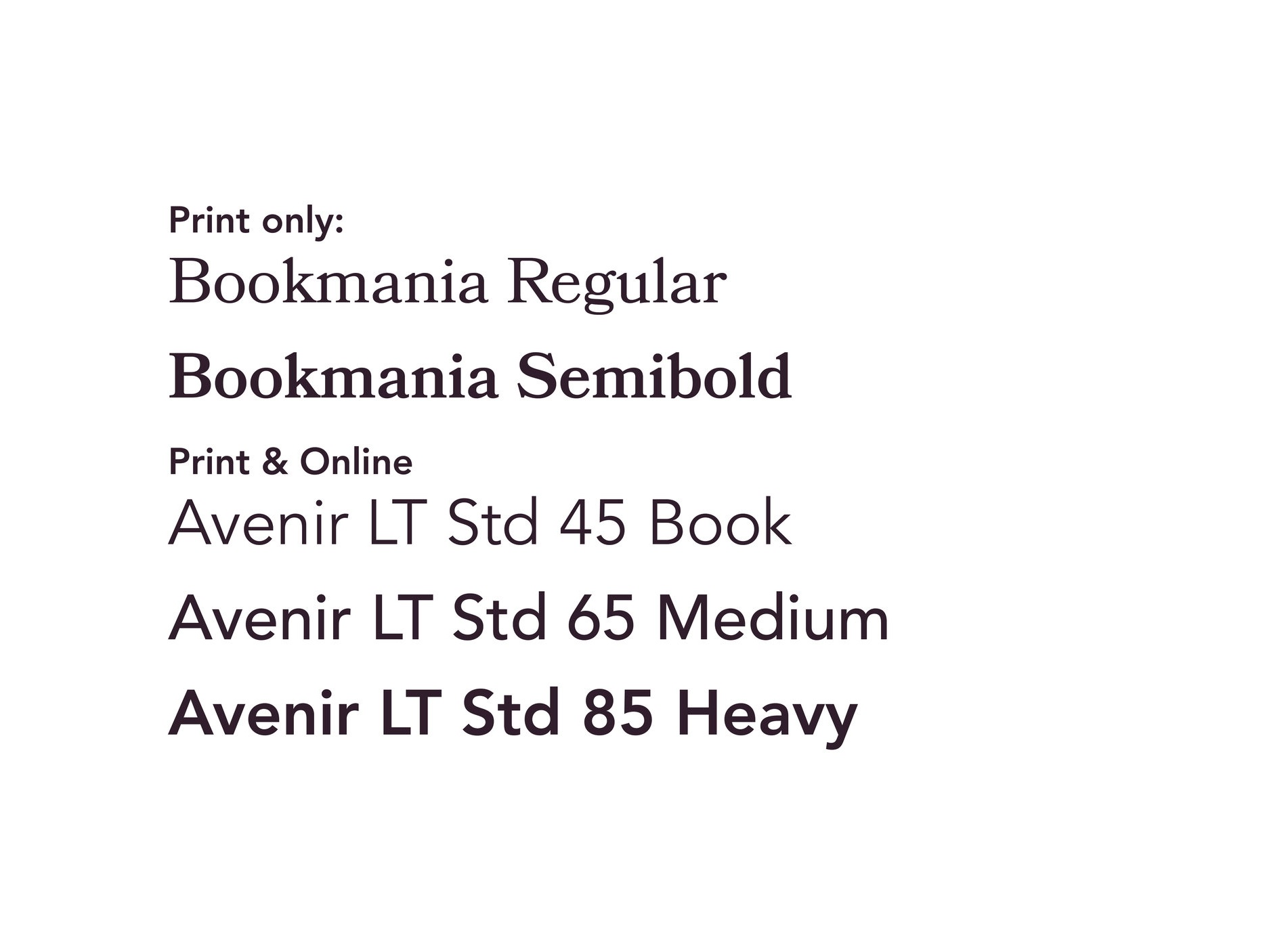
Avenir is the main typeface of the brand and part of the logotype. Part of why Avenir was chosen for the logotype was because it was a flexible typeface and works well for both screen and print materials. Avenir is supplemented by Bookmania in the publication.

