Typographic Analysis: Dwell Magazine
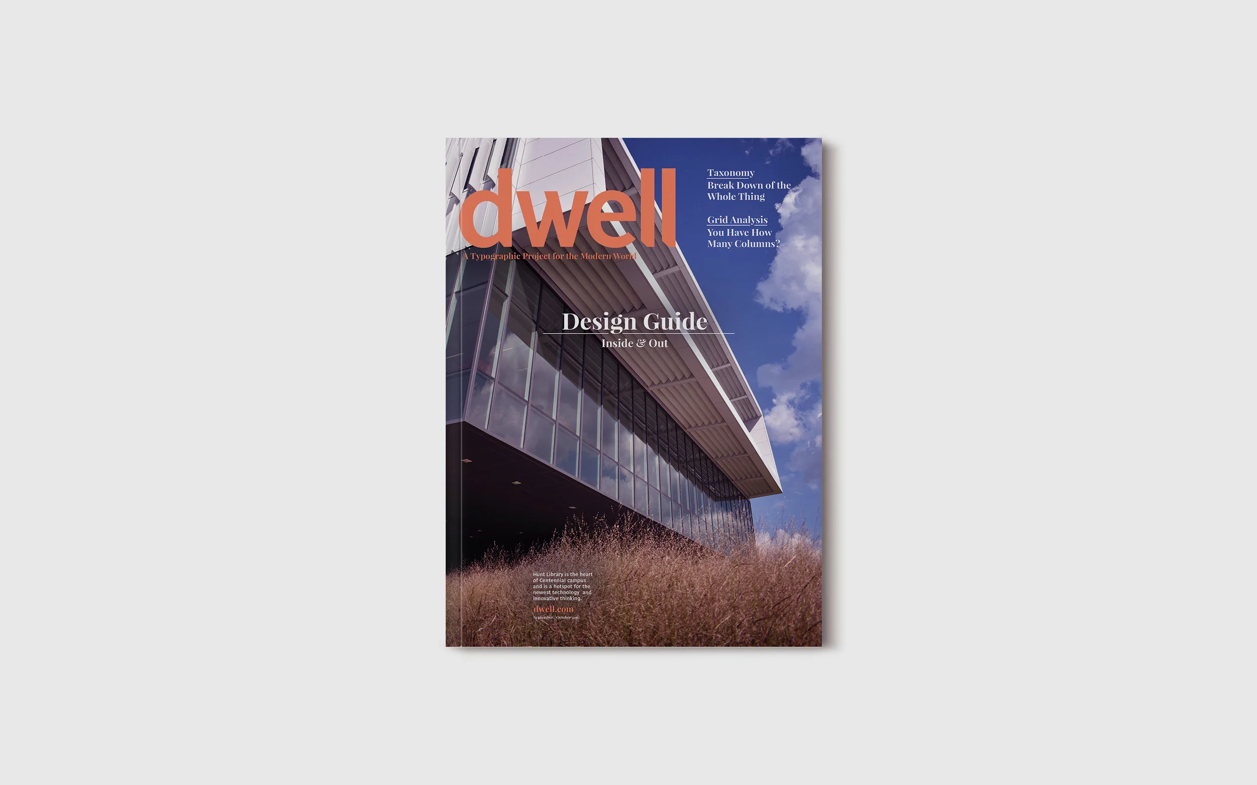
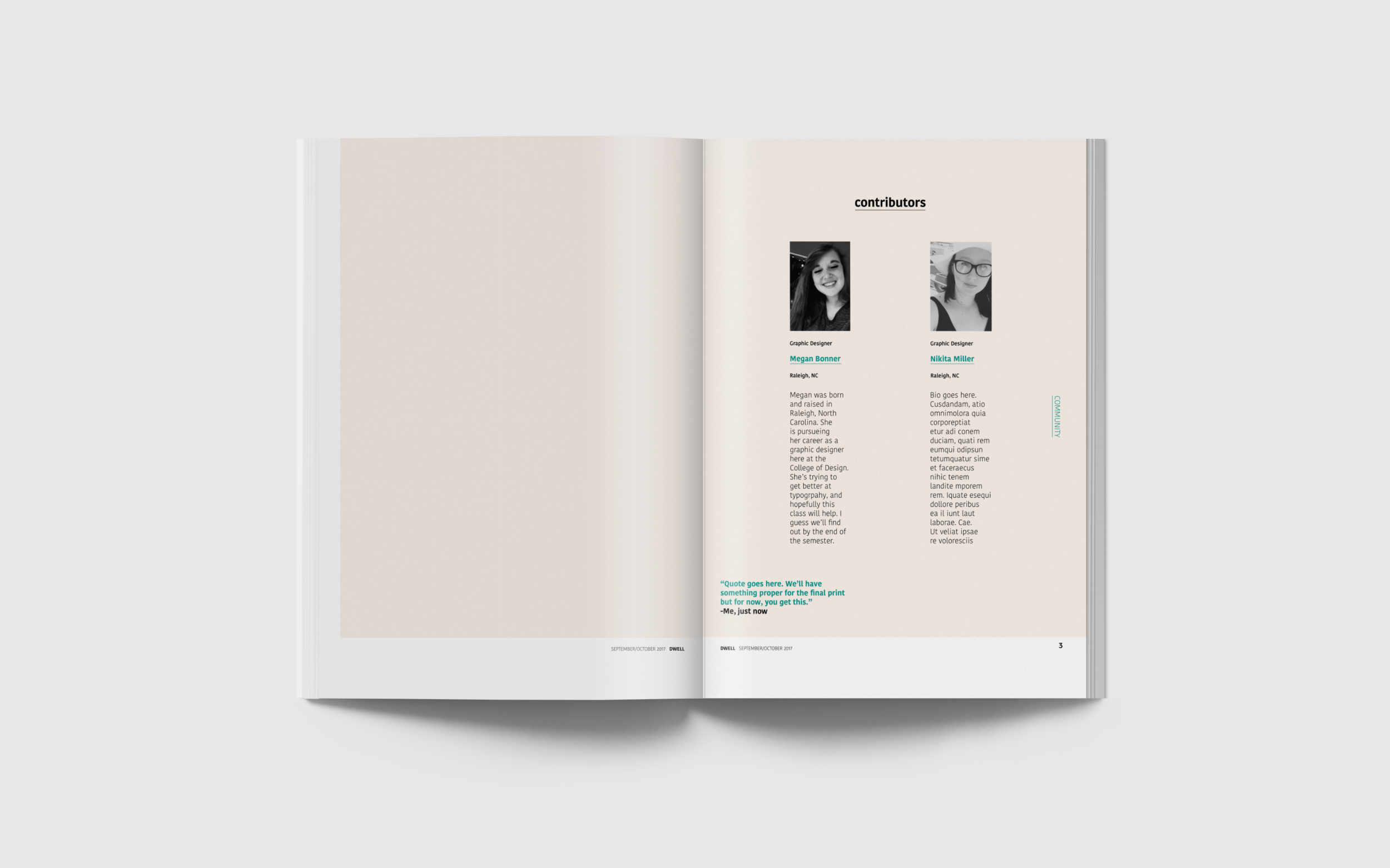
This is a small booklet that I worked on with Megan Bonner for Typography III. Our assignment was to chose a magazine from a predetermined list and analyze its typographic elements. What we found would then be curated in a booklet that we created to mimic the style of the publication we chose, in this case, Dwell Magazine.
Megan completed all of the photography in the book let along with creating overall layouts of the spreads within the grid system I set up. I worked closely on consistency between pages and typographic crafting for the booklet.
Process
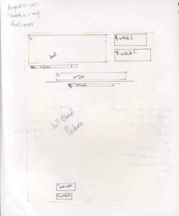
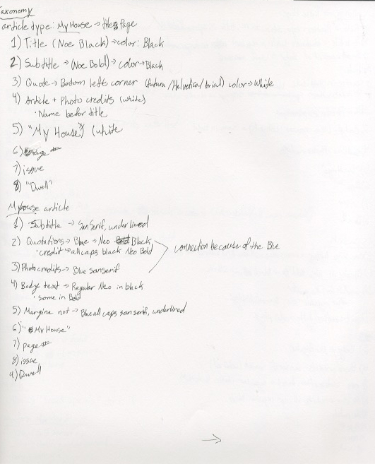
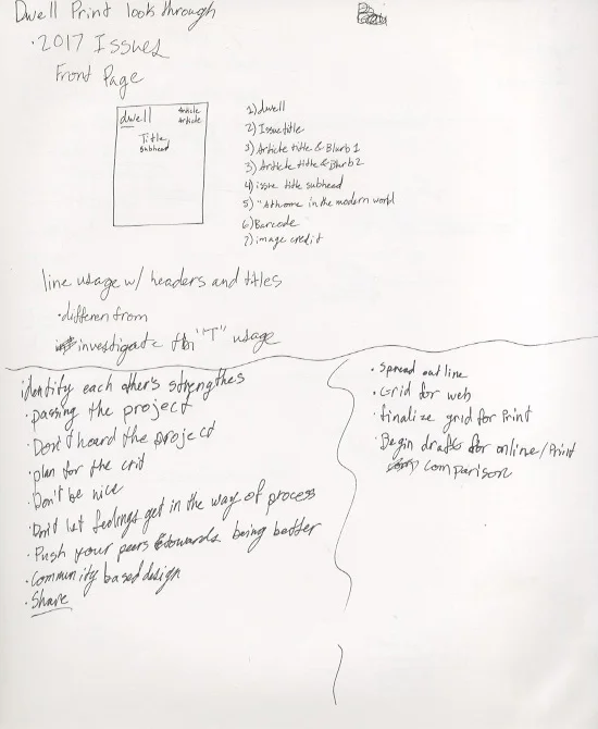
These are a series of scans from my sketch book in about my study of Dwell’s print and online presence, most of which focuses on typographic hierarchy and usage.
First Completed Draft
This was our first completed draft of the booklet. There were plenty of changes between the two and seeing the booklet on paper for the first time was highly informative to our process.


